Light+Truth Podcast
ROLE: naming + identity + messaging + social media system +
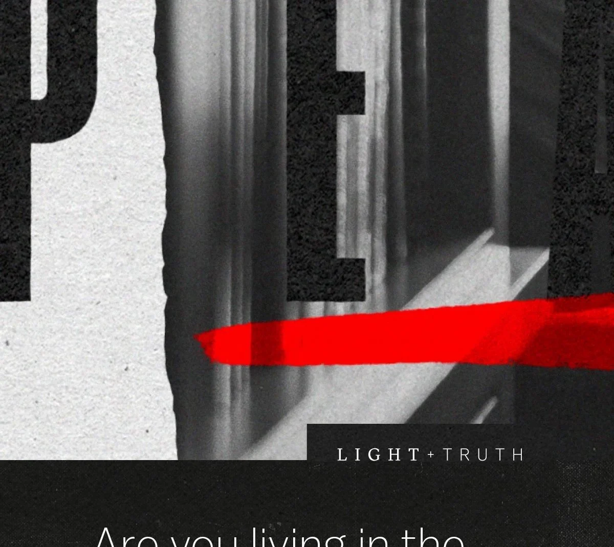
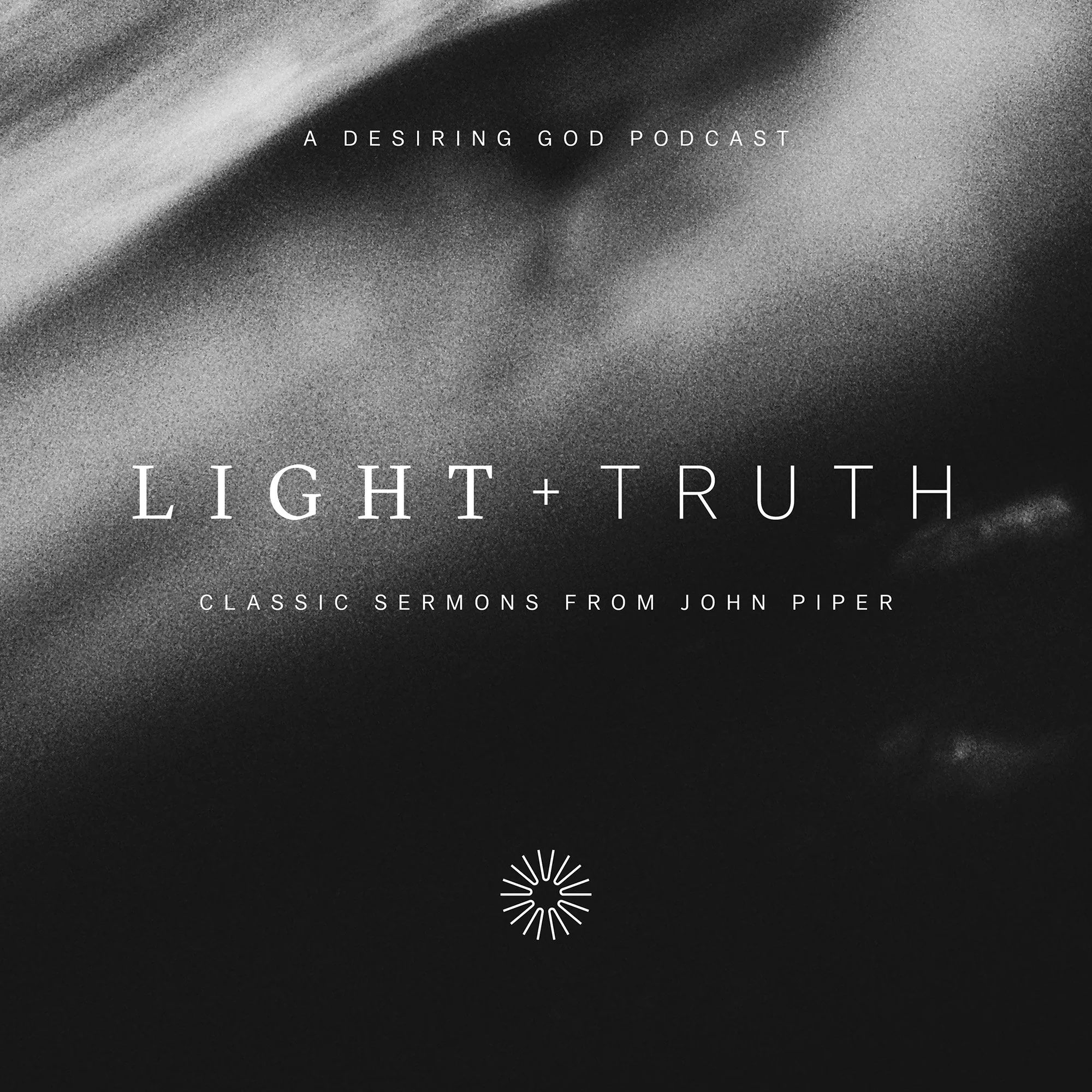
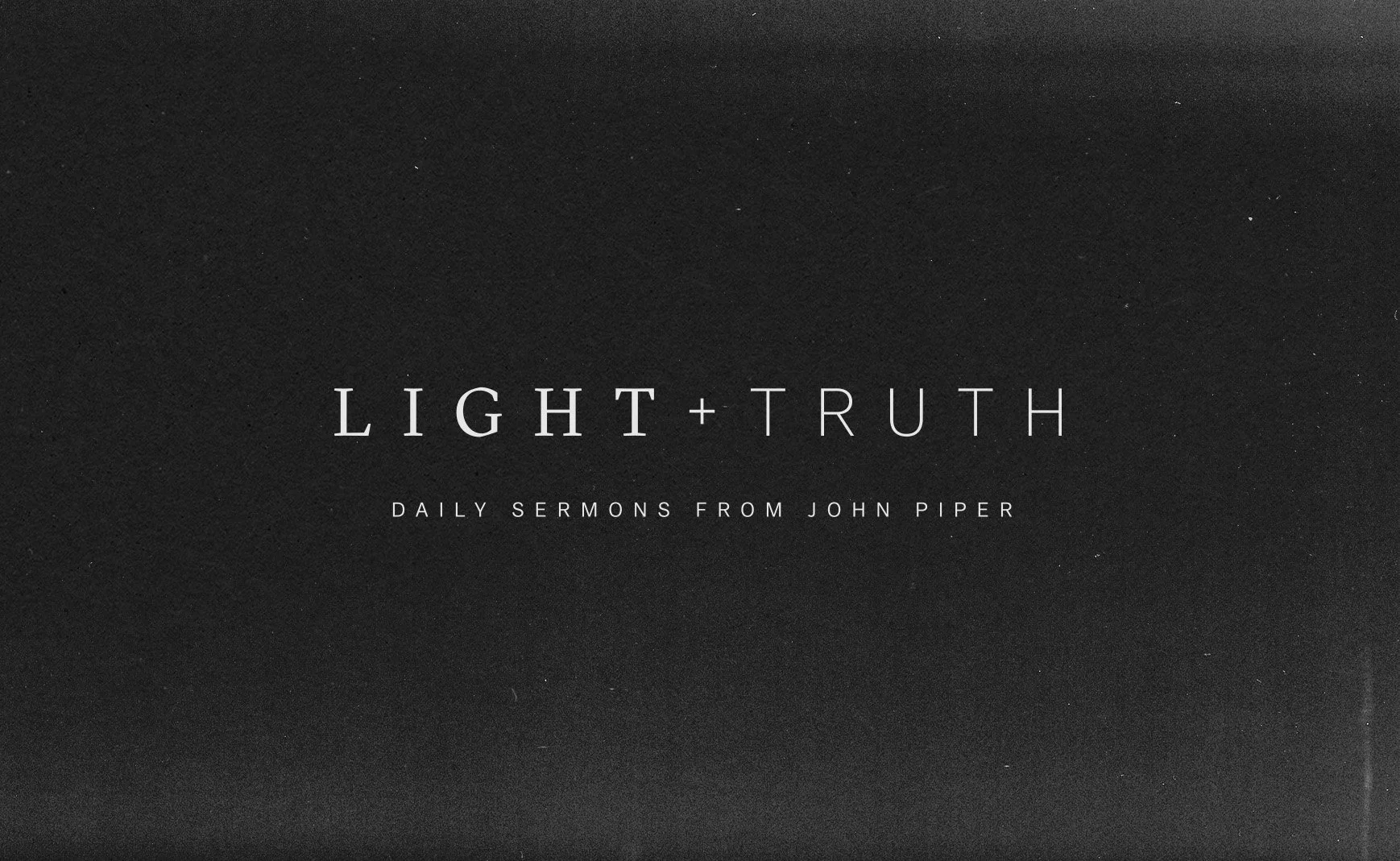
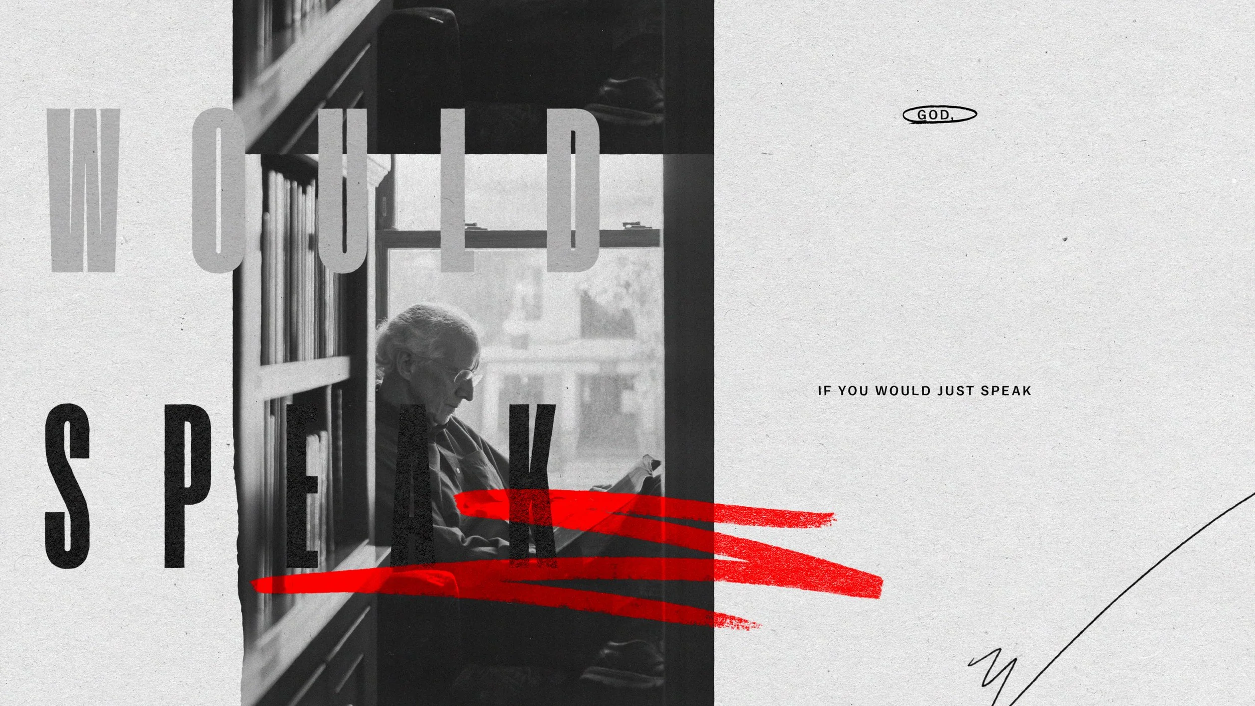
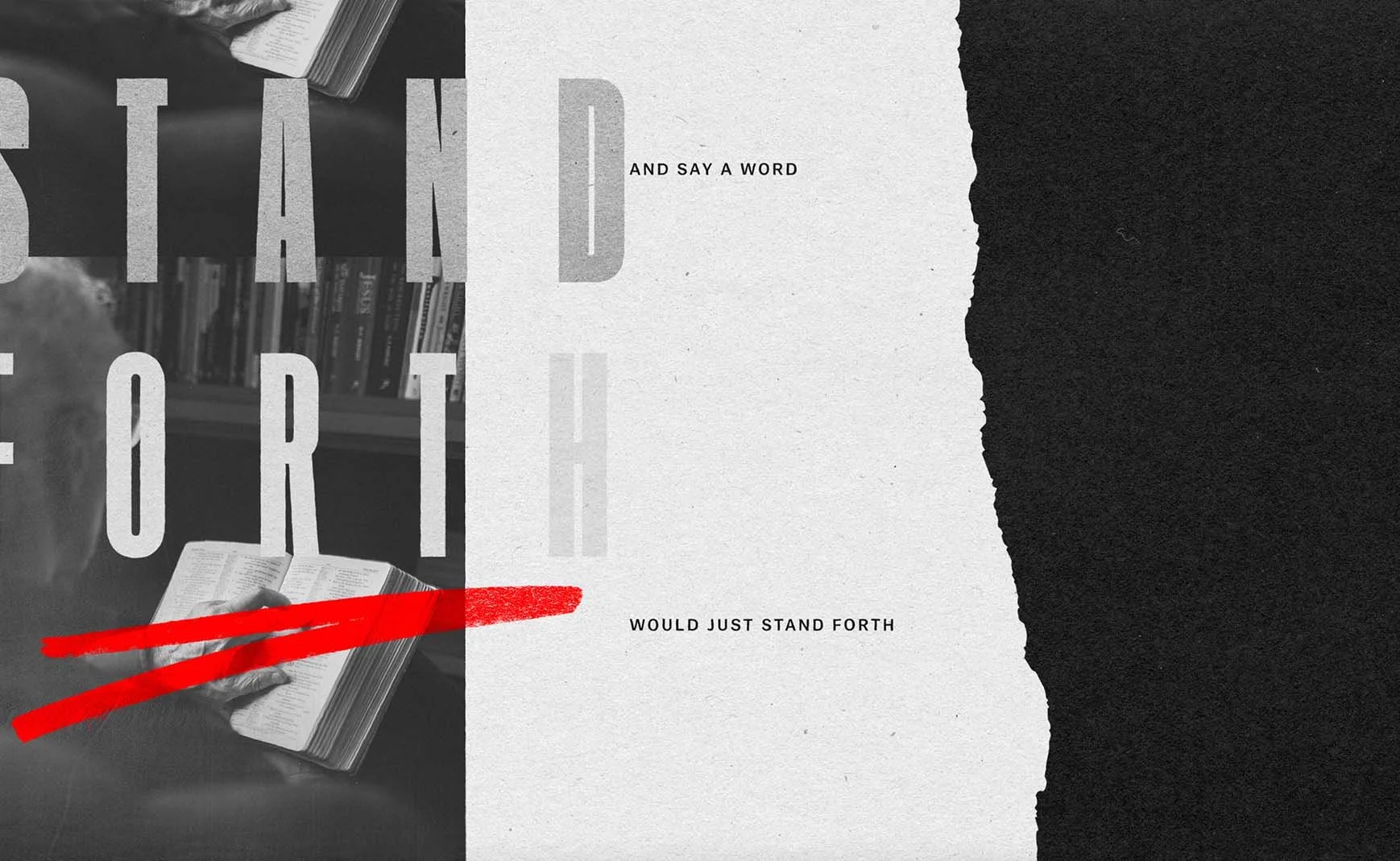
The first task was naming: finding language that could carry the weight of the content and give the design somewhere to go. Psalm 43 provided both. "Send out your light and your truth; let them lead me" gave the podcast its name and the design its governing logic, and shaped every visual decision that followed. In the psalm, it is the word of God and proclamation that illuminate: light cast so that what is true can be seen. The design follows that logic. Dark fields dominate every surface, not as atmosphere, but as the condition that makes the light meaningful.
Let’s create something meaningful together.