—
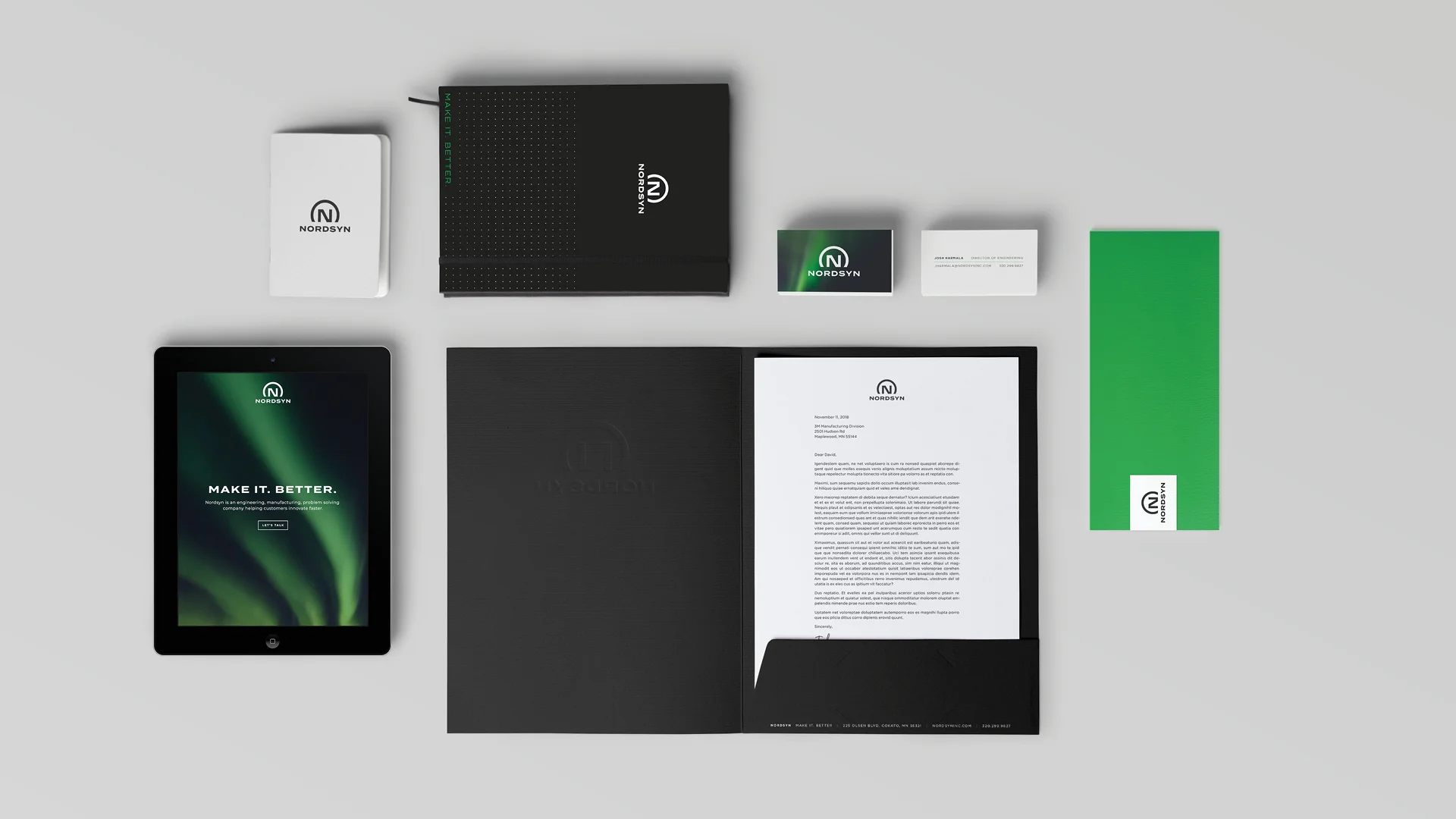
Nordsyn is an engineering, manufacturing, and problem solving company, on a mission to help customers innovate faster. From naming and messaging to brand development, we were involved in all the early steps to help this startup get on their feet and hit the ground running.
The name is rooted in the company’s northern location, and inspired by both the Swedish heritage of the founders and the insight that Nordsyn bring to each project.
We further developed a concise, simple, yet meaningful tagline, “Make it. Better.” The tagline acts as both a rallying cry, and a clarifier. Unlike other companies, Nordsyn offers complete process solutions, from problem identification to design to production. “Make It” connects to the manufacturing / production part, and “Better” brings in the innovation, insight, and problem solving capabilities.
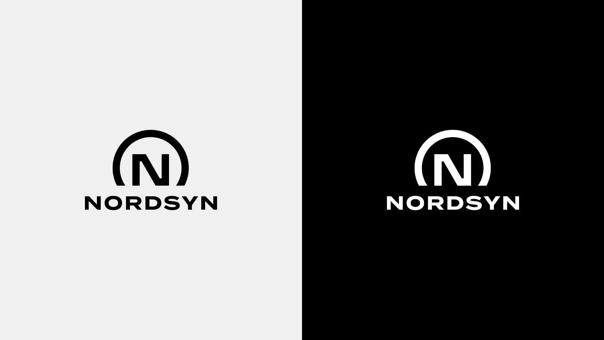
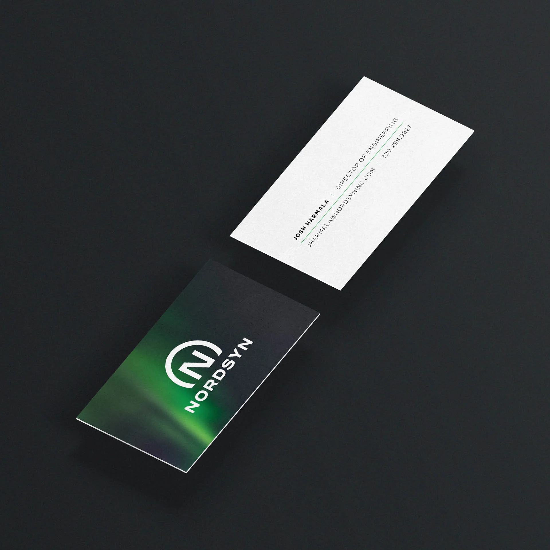
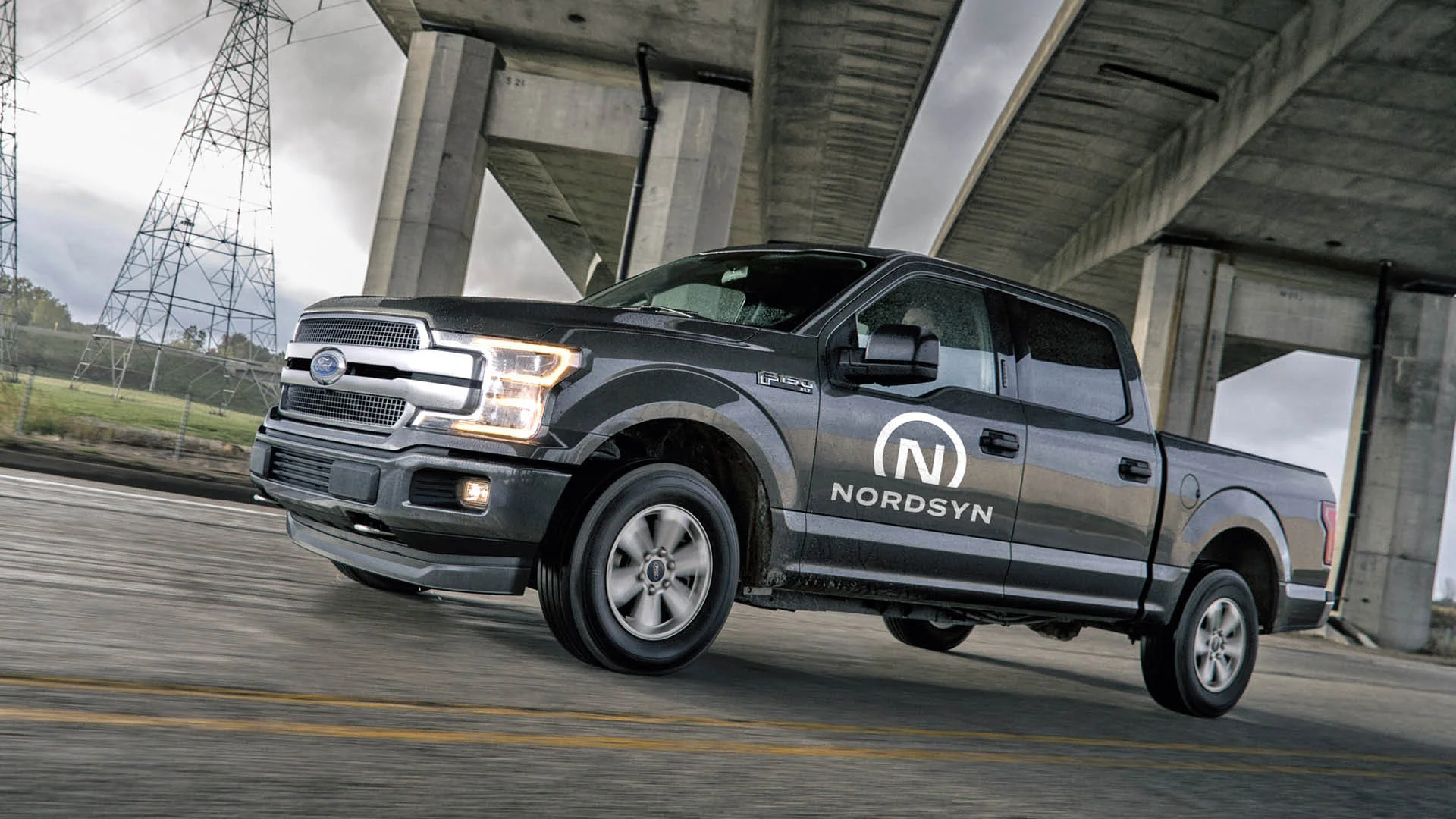
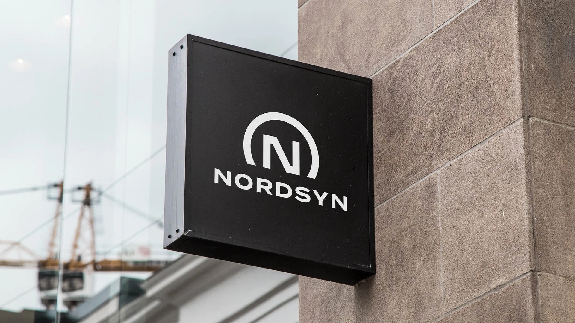
These same ideas were the building blocks for the Nordsyn visual identity. A custom letter “N” coupled with an arch signifies bringing vision to bear on on every project that Nordsyn touches. As a company located in Minnesota, the arch also serves as a symbol of the Northern Lights across the Minnesota skies.