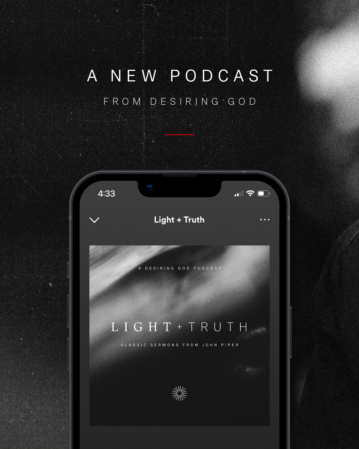
Light+Truth Podcast
A daily podcast from Desiring God featuring classic sermons from pastor and author John Piper.
CREATIVE DIRECTION + NAMING + BRAND IDENTITY + MESSAGING 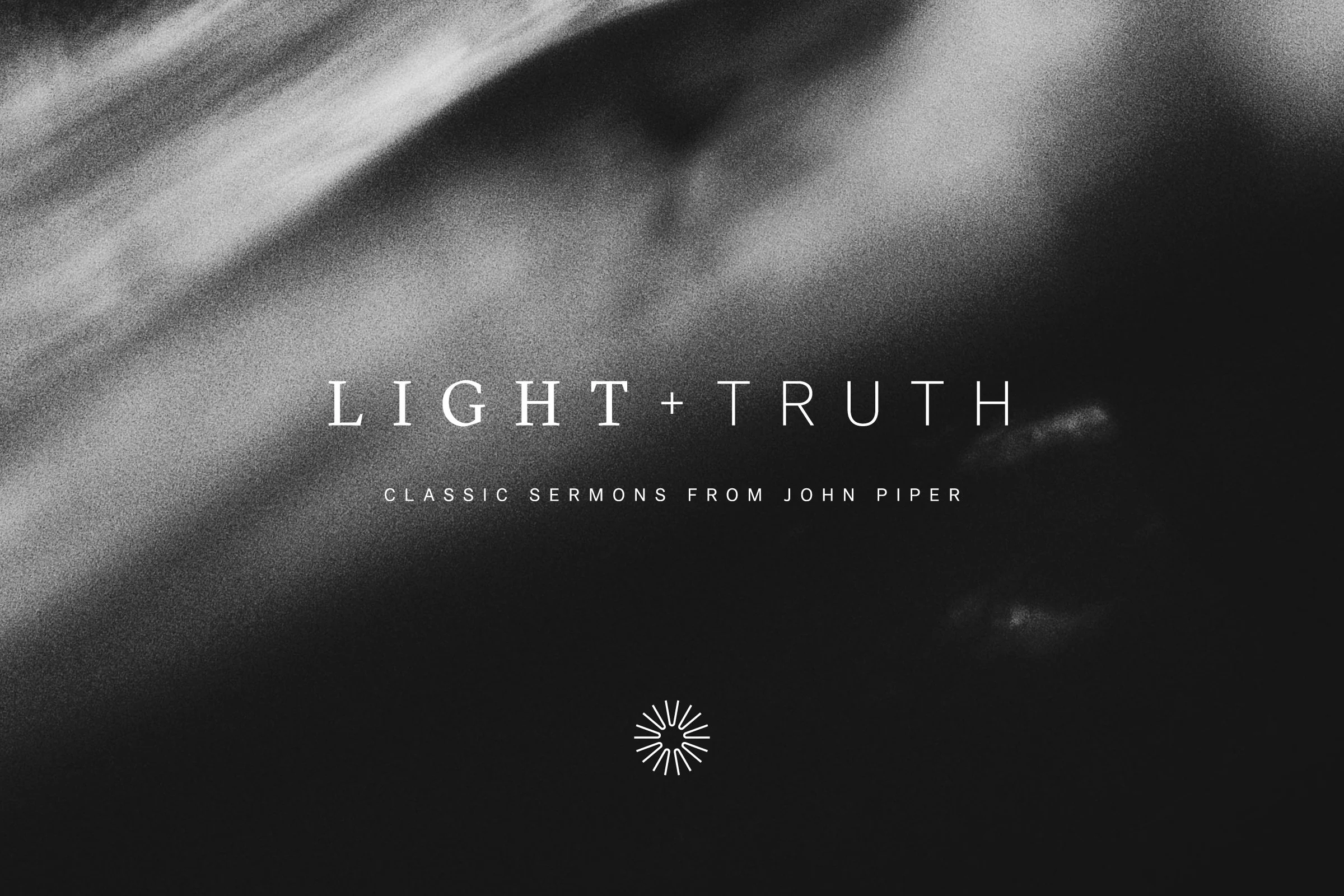
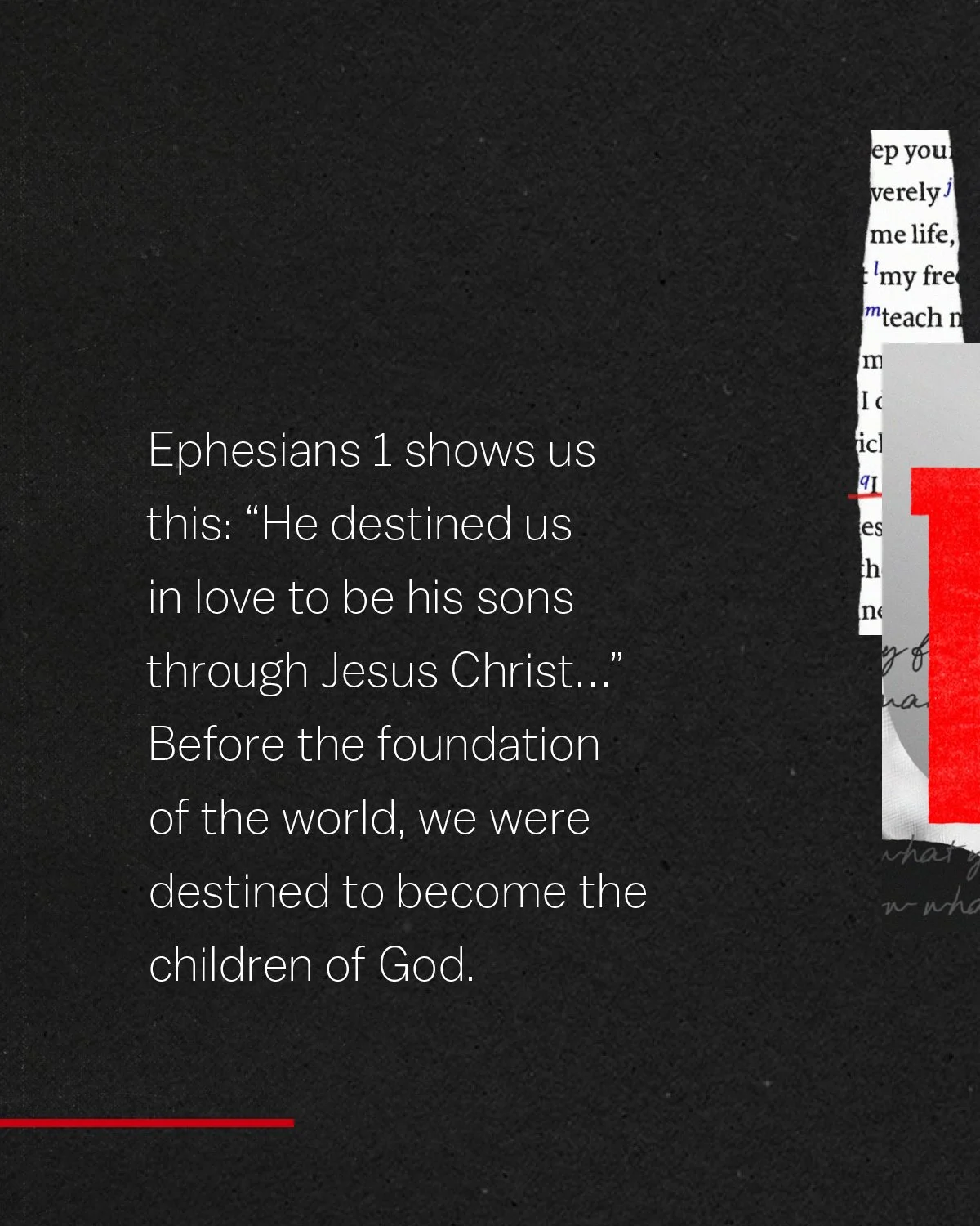
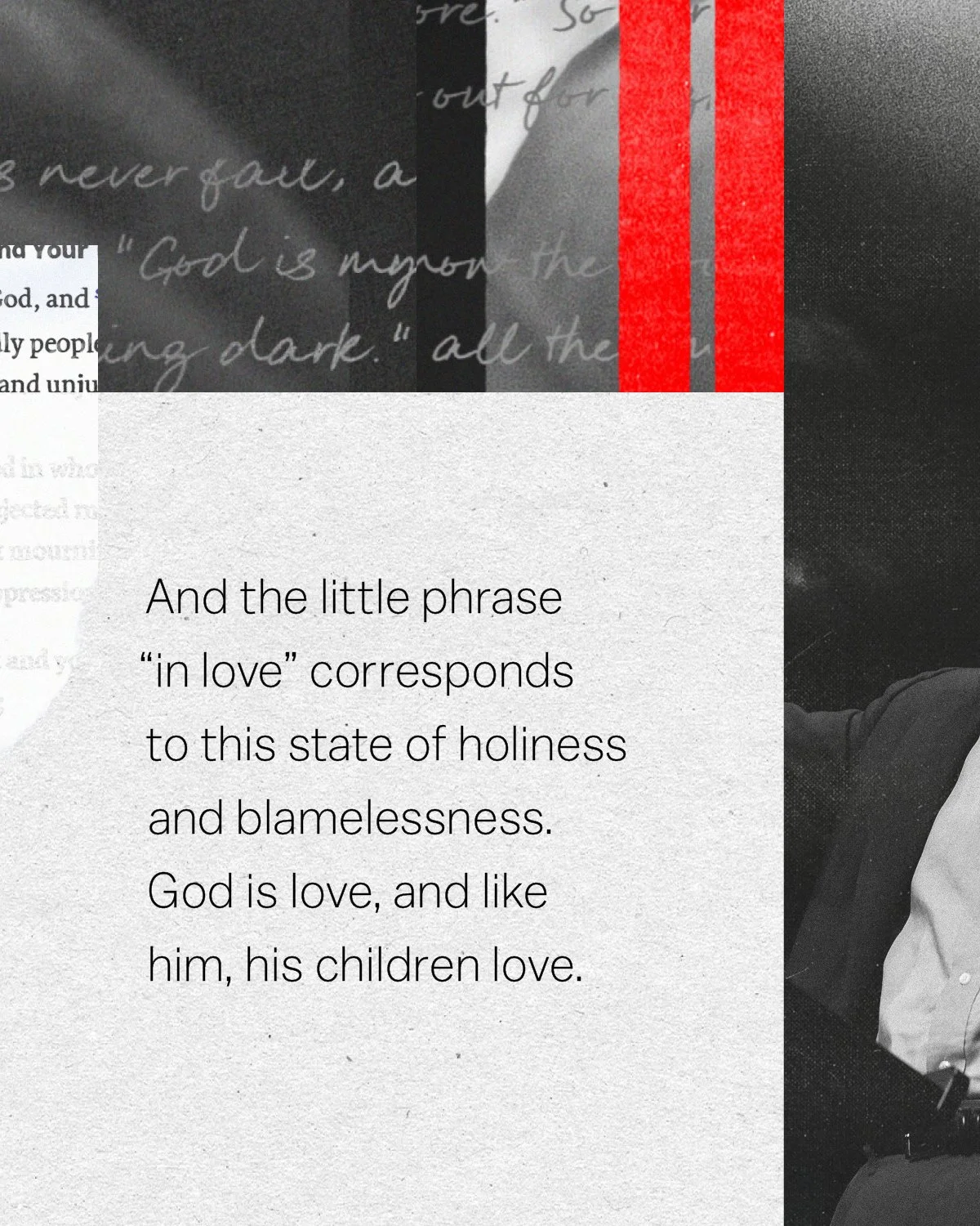
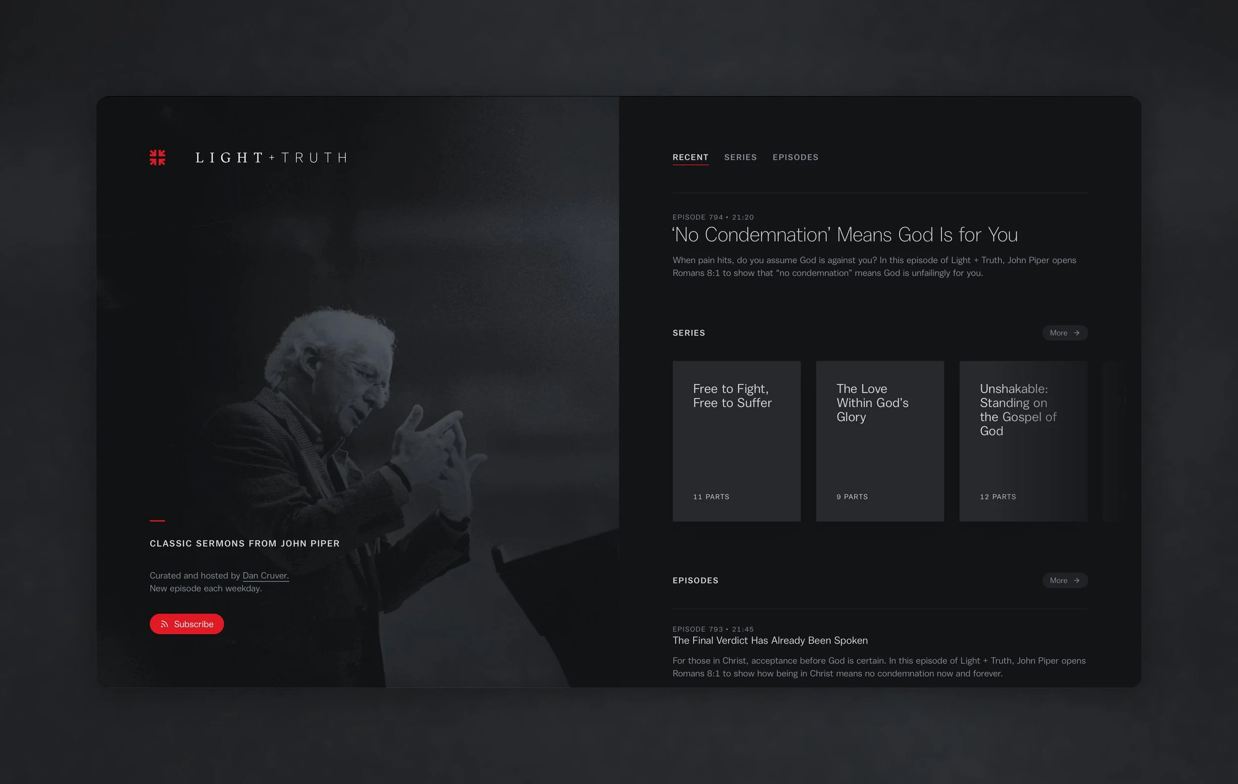
The first task was naming: finding language that could carry the weight of the content and give the design somewhere to go. Psalm 43 provided both. “Send out your light and your truth; let them lead me” gave the podcast its name and the design its governing logic, and shaped every visual decision that followed. In the psalm, it is the word of God and proclamation that illuminate: light cast so that what is true can be seen. The design follows that logic. Dark fields dominate every surface, not as atmosphere, but as the condition that makes the light meaningful.
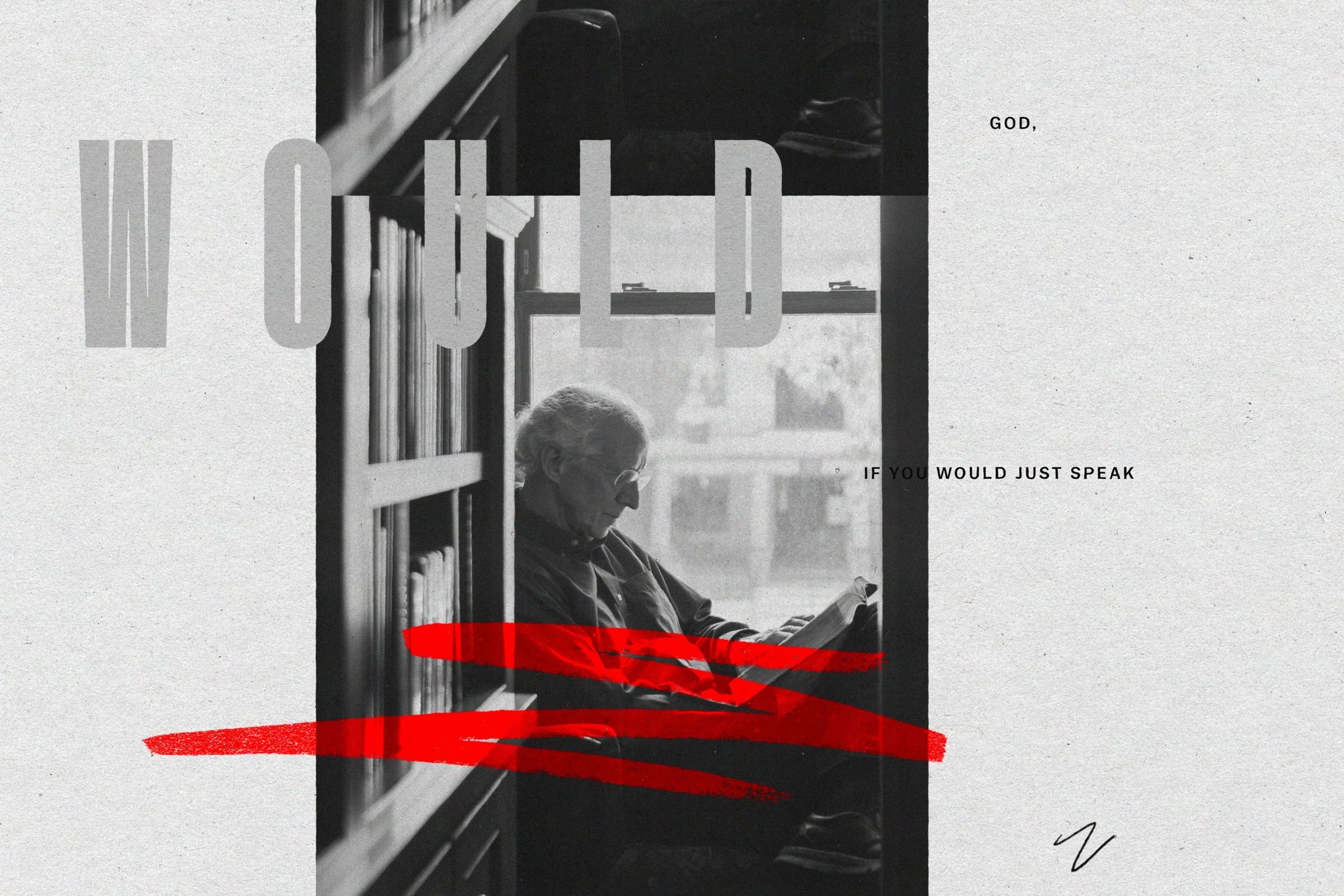
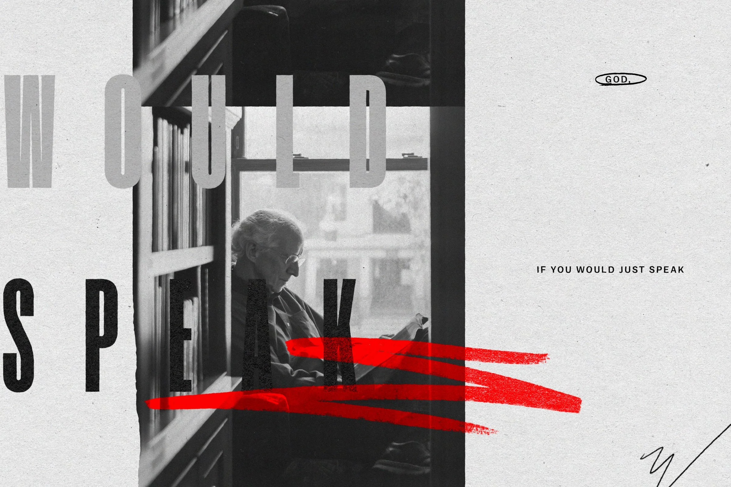
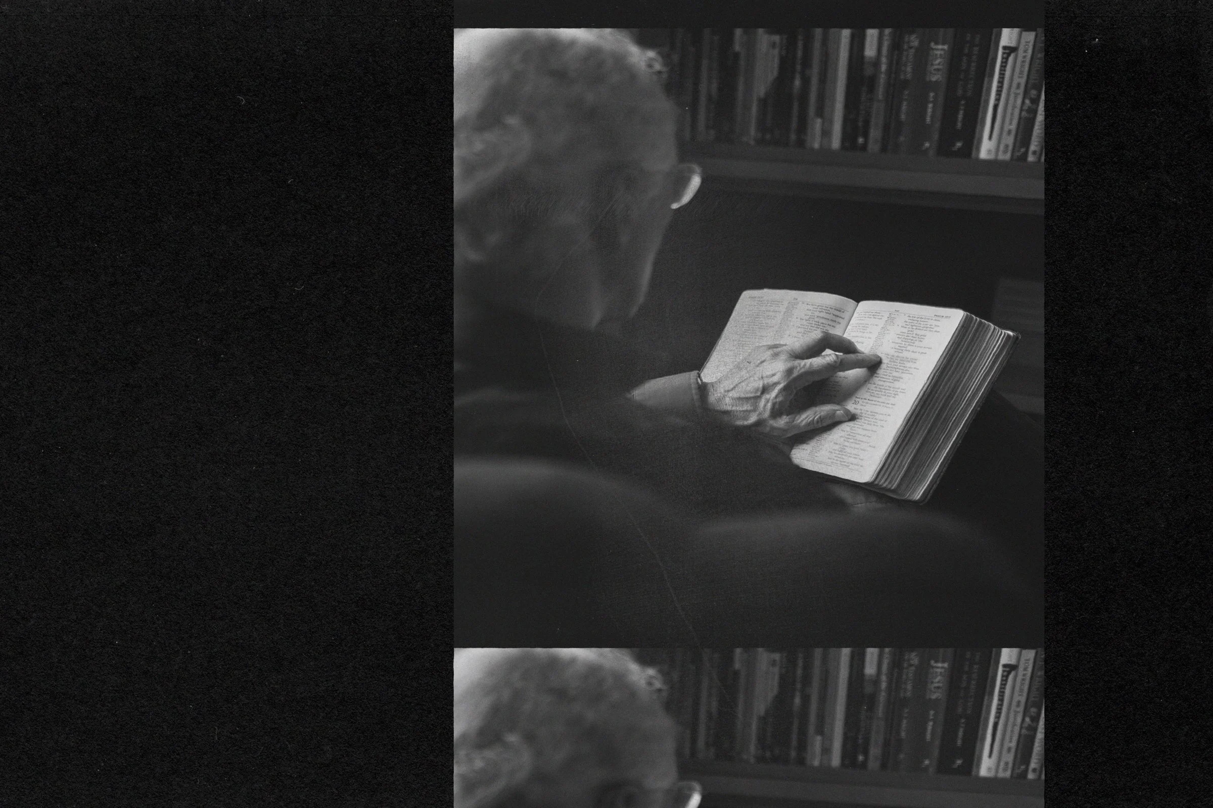
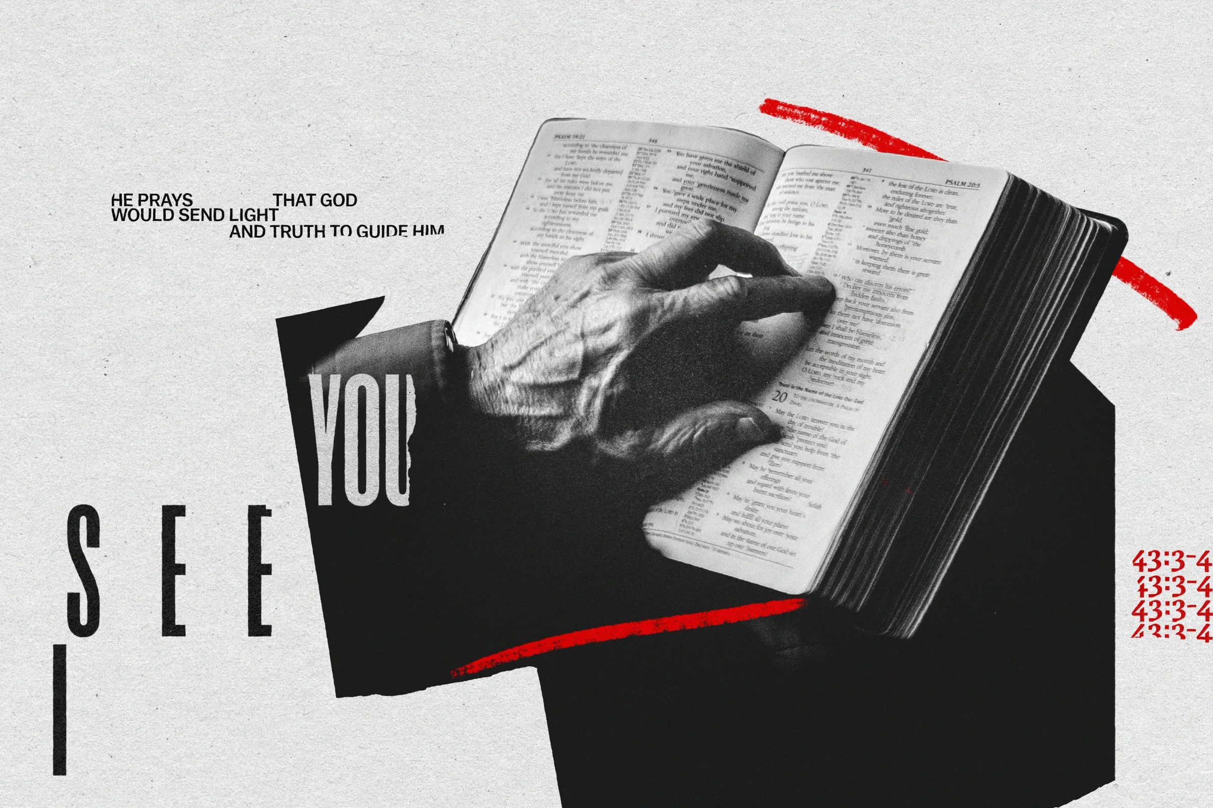
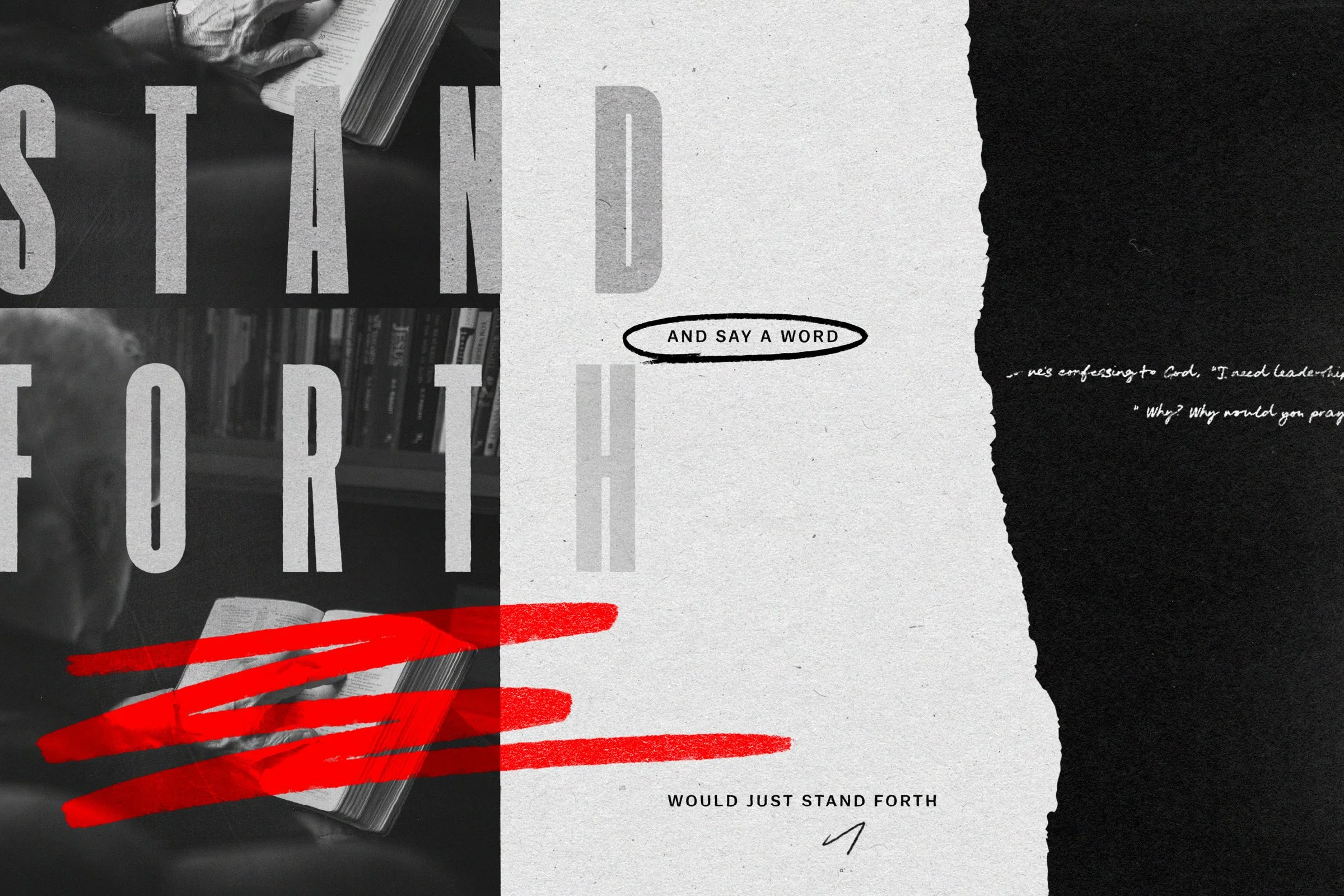

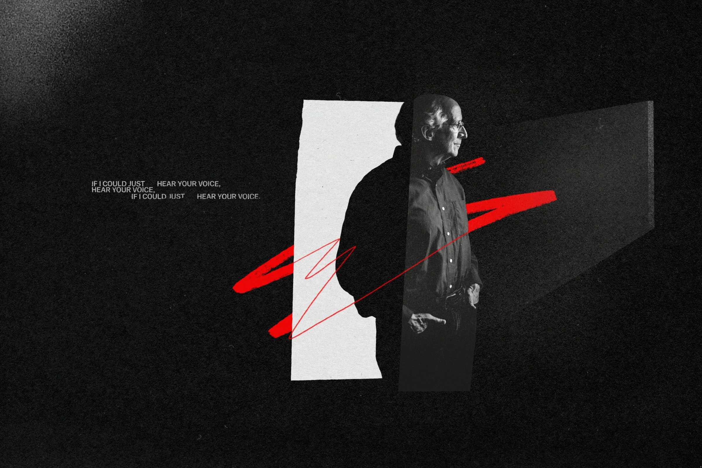
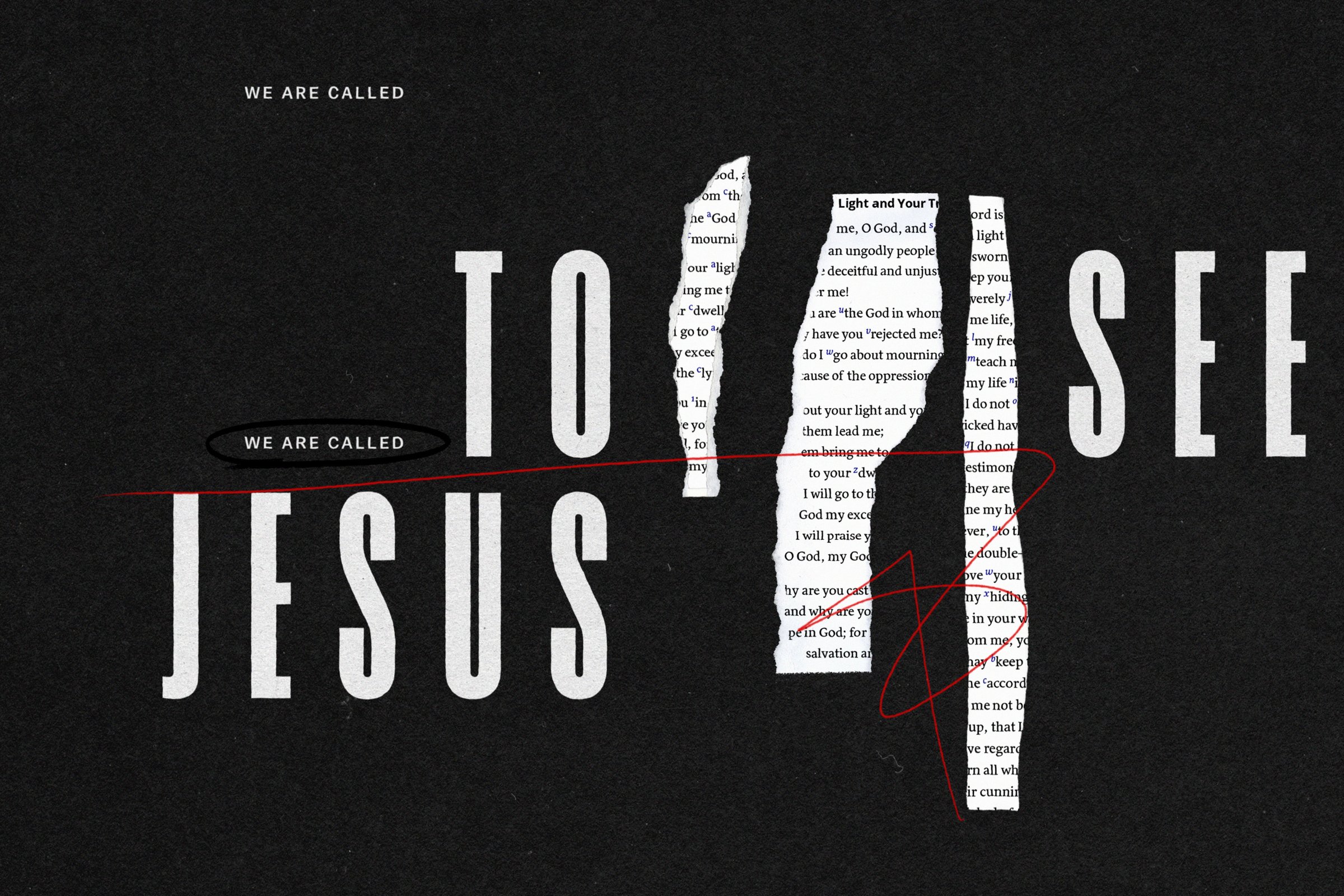
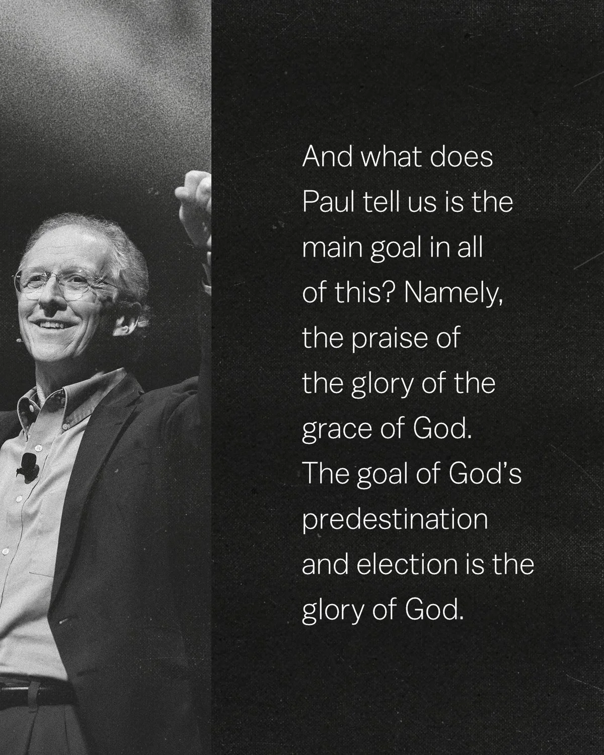
Light + Truth draws from John Piper’s thirty-three years of preaching, a body of work that, handled differently, could have felt like a museum. The goal was not to commemorate it but to put it back into motion. The first decision was to resist the obvious: warm nostalgia, worn textures, the visual language of retrospection. Instead the identity was built around photography of light itself, rays breaking through, illumination caught in the act, set against deep black fields. Archival photography of Piper preaching carries a unified grain texture across every surface, collapsing the distance between a sermon from 1990 and a commute-length listen today. The custom mark, repeating forms suggesting the pages of an open Bible arranged into a shape that reads simultaneously as sunrise and eye, holds the podcast’s central premise in a single image: to hear the word preached is to see.


From the beginning, the identity and the episode promotion system were understood as two different problems requiring two different registers. The podcast needed to feel settled and substantial, something worth returning to every day. The promotion needed to create momentum, pulling people in who hadn’t yet committed to listening. Each episode’s social carousel, sequences of five to ten images built for swiping, uses the same visual devices as the identity but puts them in motion. Type bleeds off one frame and resolves in the next. A red line begins its trajectory in one image and completes it in another. The gesture of swiping becomes part of how the content is understood. One visual grammar, doing two different kinds of work.

The identity was designed to scale across a web article series, an eight-part email journey, social promotion, and printed posters, all from a visual system spare enough to work at every scale it was asked to occupy. The series was timed to accompany the release of a revised edition of John Piper’s Desiring God, the book that gives the ministry its name and its mission.
CREATIVE DIRECTION: MATTHEW TAYLOR GRAPHIC DESIGN: RUBEN CABRERA, MANDIE SPEAR, MATTHEW TAYLOR, SHANE THACKER SOFTWARE ENGINEERING: BEN HUTTON, JOE OSBURN, SHANE THACKER