How to Fight for Joy
A Desiring God article series on fighting for joy in God in the face of all that might oppose it.
.
CREATIVE DIRECTION + DESIGN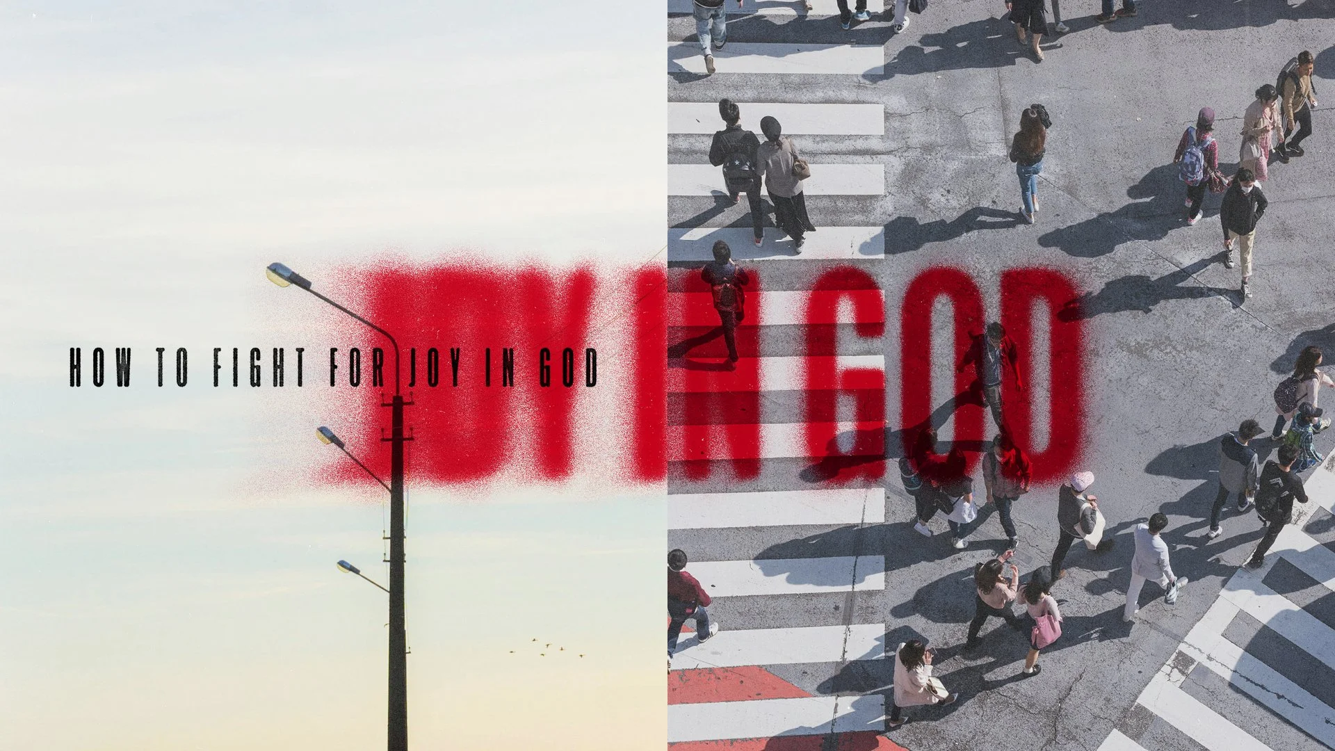
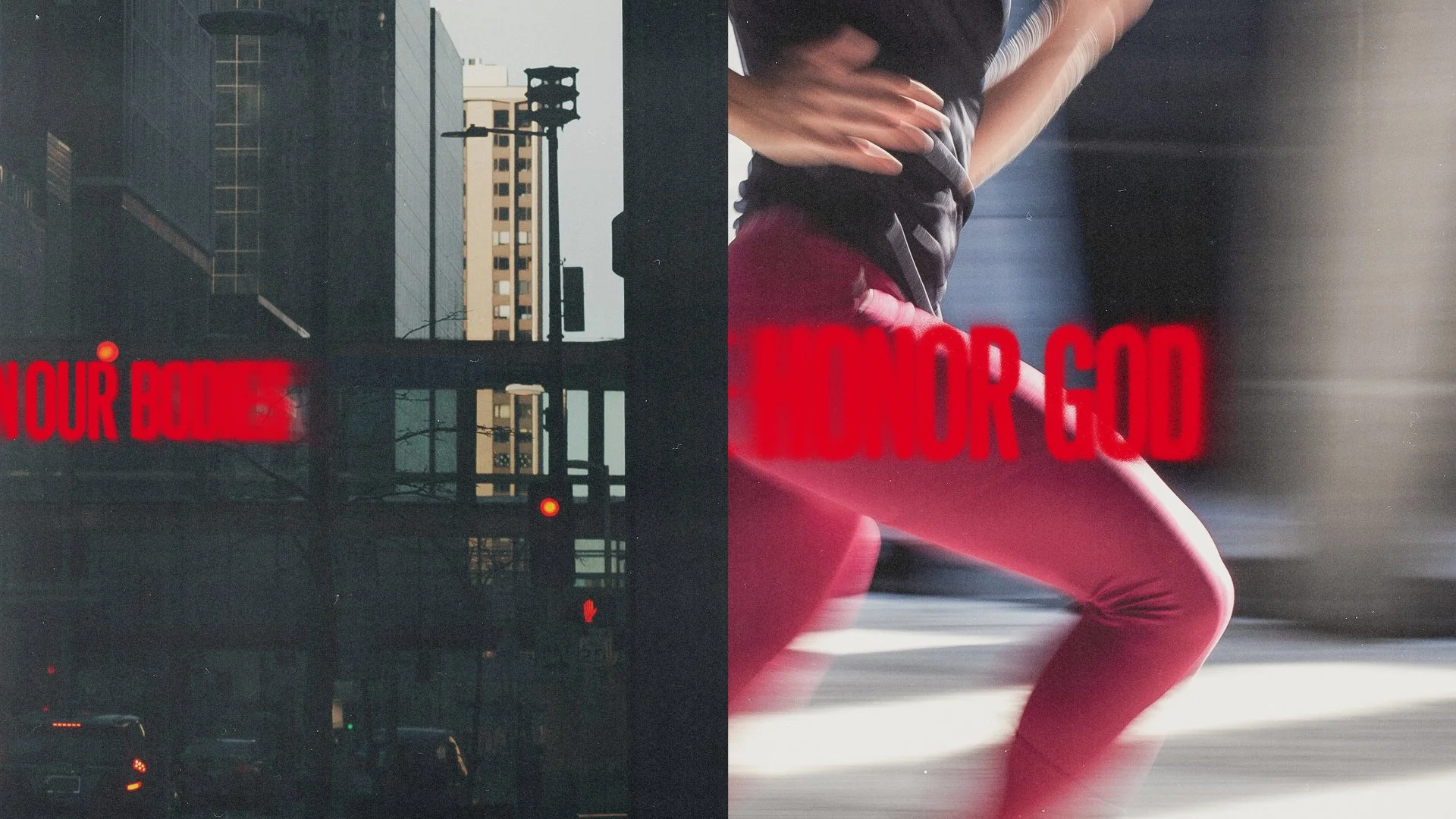
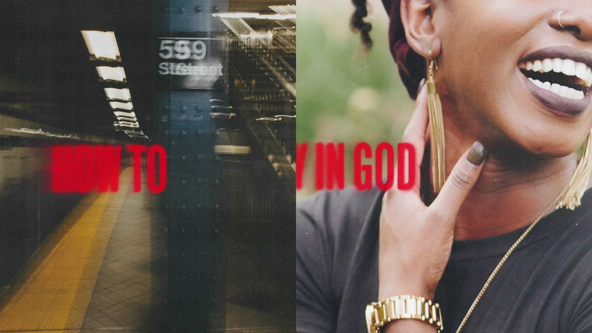
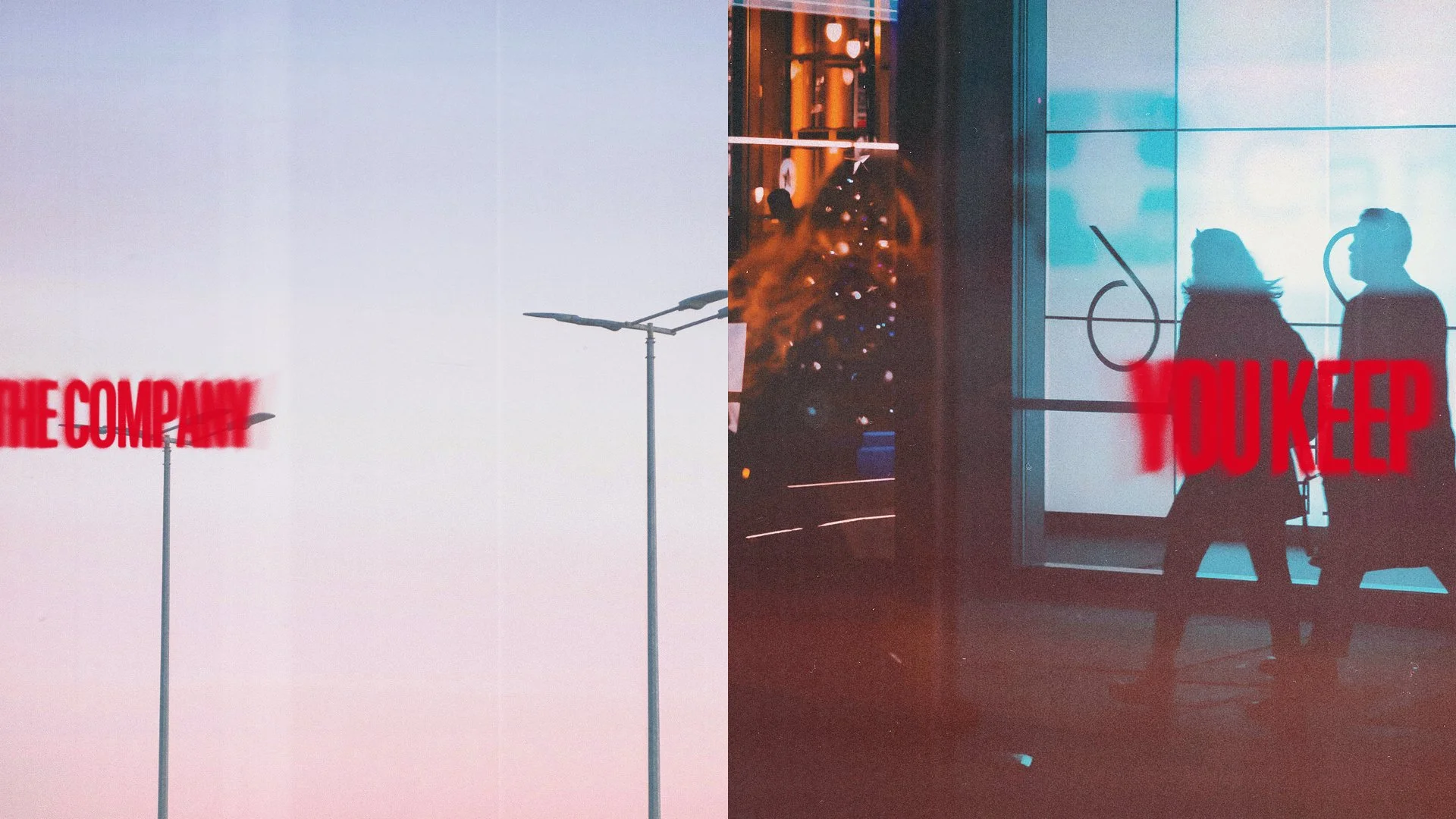
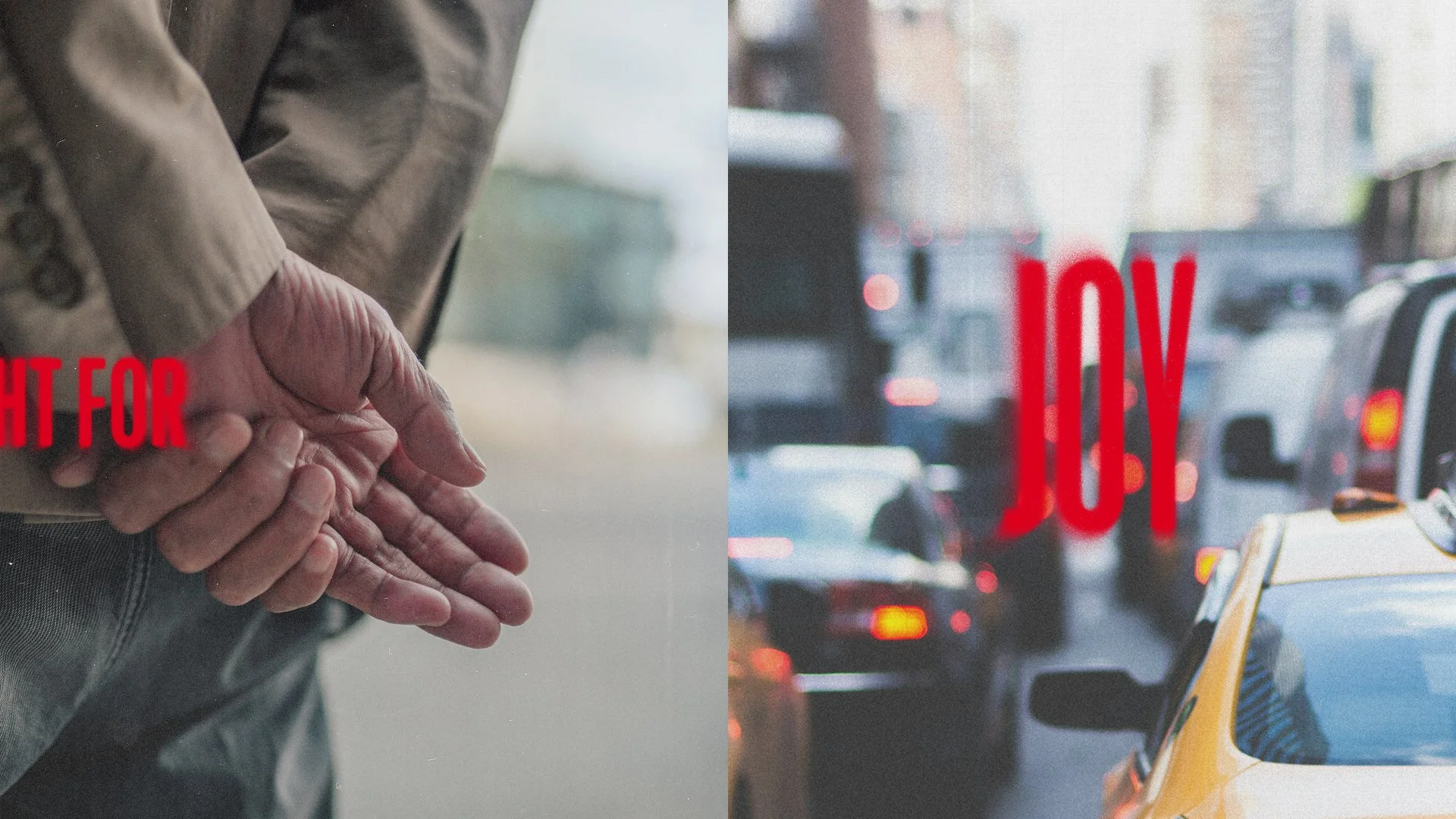
The title of the series already contained its own tension: joy is something you fight for, which means it doesn’t come without effort, and it doesn’t come without opposition. The design problem was how to hold that tension visually rather than resolve it too quickly into something merely beautiful or merely gritty. The answer was to build conflict into the structure of every image.
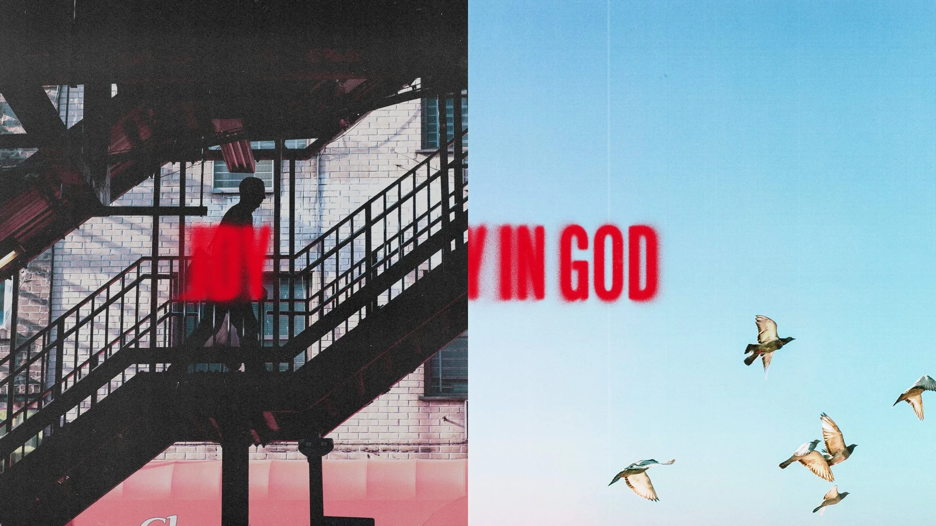
The central device is a split image: two photographs placed side by side, with the series title running in large, spray-painted red type across the seam between them. The split is not decorative. Each pairing was chosen so the two images read against each other: a subway platform alongside a woman laughing; a crowded crosswalk alongside an open sky; a figure on a fire escape alongside birds in flight. On one side, the weight and texture of ordinary life: commutes, city streets, crowds, the grind. On the other, something that gestures toward beauty, stillness, or transcendence. The seam between them is where the fight happens. The type that runs across it names the battle.
The spray-painted letterforms do two things at once. Visually they carry energy and urgency, the feeling of something stenciled onto the city itself. Contextually they reference the urban environment the photography inhabits: the “post no bills” signs, the tagged walls, the language of the street. The series title belongs to that world even as it calls readers out of it.
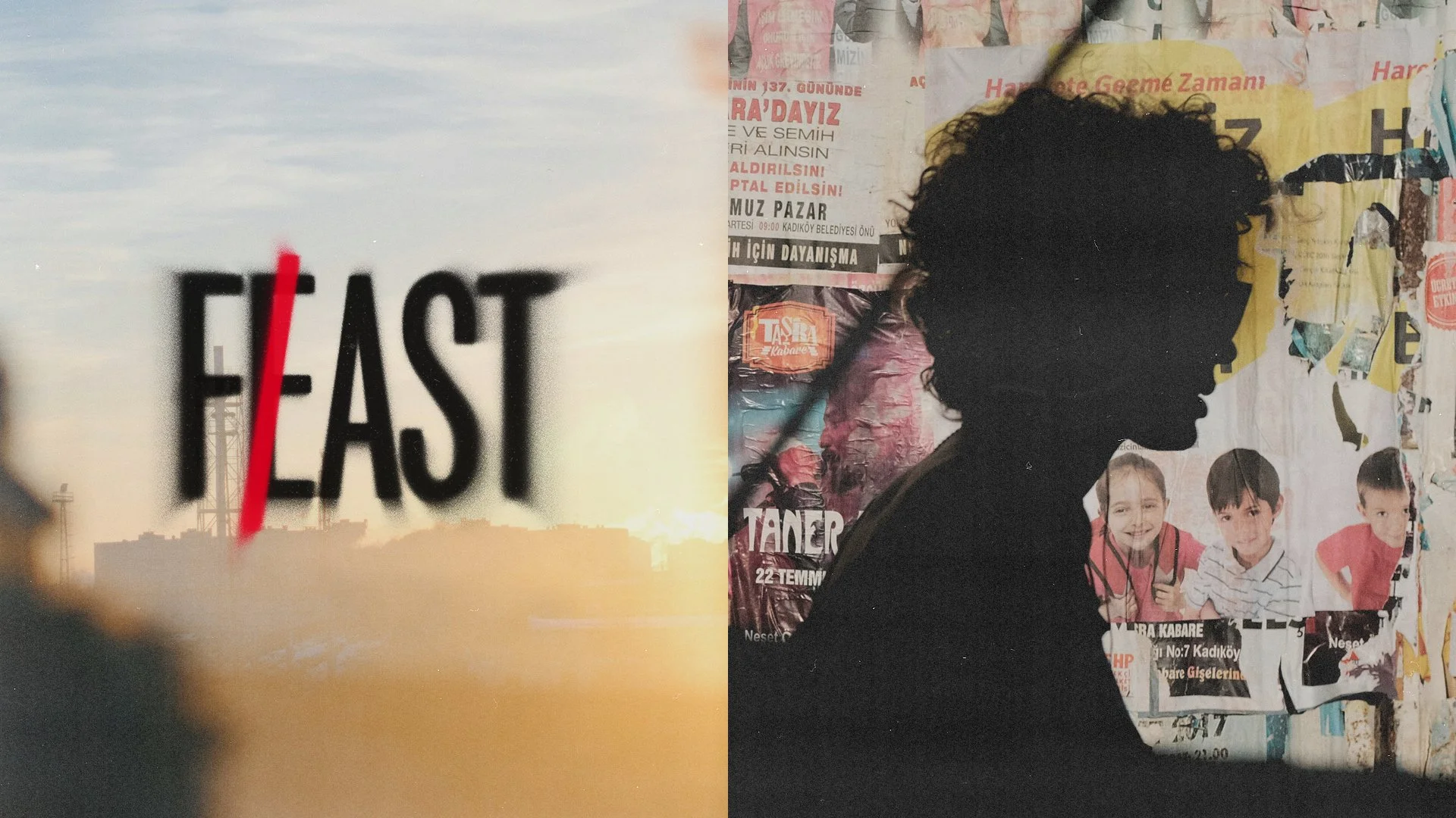
The typography does its most satisfying work in the design for the last article in the series. “Feast on the Word, Fast from the World” presented an opportunity too good to pass up: FEAST and FAST share nearly every letter. A single red slash cuts across the E, converting one word into the other. It is a small decision with an outsized effect. The mark is both typographic and editorial, enacting the article’s central contrast in a single gesture rather than illustrating it from the outside.
The series was conceived as a web editorial package and as printed posters, a visual identity built for a single series that worked at every scale it was asked to occupy.